

 Log In
 Members
 Home
Home
 Add Reply
 Add Topic
 Topic RSS
10:30 pm

October 20, 2011
 Offline


 Quote
Quoteha! i remember John saying that oftentimes ads that are uglier/less slick have better conversion rates. I'm going to update my squeeze page with my new recording soon. would love any feedback on it if anyone has any. i've changed the box and my name to red (it used to fit better with the color palette of the artwork)- not sure if the copy and whole page is strong enough.
7:08 pm

June 7, 2011
Offline


Hey Kat,
I love the look of the page and I think I'd find it really appealing on that bases, however I don't really see much copy at all. It's missing the bold claim that is meant to pull me in, tell me what I'm going to get, why I should want it, and what I need to do next.
The only actual copy I see is "'Enter your info below, and you will immediately be sent Kat's brand new single, "One Day" from her yet to be released EP It Matters to Me!" and thats just the small copy above the opt in form that is usually just meant to be redundant.
It's sort of like going to a car dealership and seeing a nice looking car, and a few reviews pasted to the window about how great it is, but not having anyone come up to you to say, "if you're looking for a car that will cut your gas bill in half then this is the one. Too bad you weren't here yesterday, we were offering a $2000 discount. Come inside with me and I'll see if I can get my manager to make an exception and give it to you anyway"... or whatever. But hopefully you catch my drift.
I always try to imagine flagging down someone browsing past my merch table and trying to pull them in and sell them a CD. What would it take to snare their interest? Then convert that into a bold claim.
Right now you are effectively just calling out "it matters to me", which, while presumably a song title, doesn't do much to create desire.
So in a nutshell, I think the page LOOKS awesome, but it really needs some additional copy. Namely a headline.
Having trouble with your marketing? Wish you could have an experienced direct-to-fan marketing expert look over your actual campaigns, music, or content and offer feedback? Or perhaps you’re just looking for a little one-on-one assistance so you can ask questions that pertain to your specific goals and get a second, more experienced, perspective? Click here to book a session with me now.
2:47 am
October 20, 2011
Offline
Great points- thanks John. I'm going to work on all of that. It's kind of embarrassing that I'm missing all of that....duh!!
9:56 pm
October 20, 2011
Offline
Ok, I've been working on the copy....what do you think of this? does it do the trick do you think? (PS. I grabbed a screen shot from your page!:) but will of course change it from Jon's to Kat's! - thank you!!)
Also, I would change the text over the picture from "It Matters to Me" to "Kat Parsons".
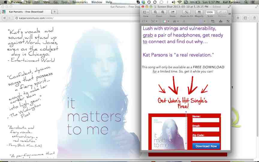

The copy is:
Lush with strings and vulnerability,
grab a pair of headphones, get ready
to connect and discover (or find out) why…(wasnt sure which is better)
Kat Parsons is "a real revelation."
This song will only be available as a FREE DOWNLOAD
for a limited time. So, get it while you can!
************************
Other copy ideas had something to do with the sunset..."sink into the sunset as Kat turns emotion into song..."
or
"Turn off your phone, let the sun set, and be carried away by the lush stings and vulnerability of Kat Parsons...."
"Even if my heart breaks, there are no mistakes in love..."
I am also wondering if I need this on the page somewhere:
"Download the new single from singer-songwriter Kat Parsons' yet-to-be-released new EP "It Matters to Me"."
I think it's pretty clear, but don't think I have a very objective view point.
What do you think?
Thanks so much for your thoughts!
11:48 pm
June 7, 2011
Offline
Honestly, for me personally I don't really connect to any of those words. I don't find myself secretly desiring lush, strings, vulnerability, sunsets, or turning off my phone. But it may very well be that those words strike chords with other people. That all comes down to knowing your demographic. I also don't love that the copy is off to the side. My eyes go to the center. I think you're risking a lot to leave that space empty. It would be worth spending $100 - $200 to split test a bunch of different squeeze pages on Facebook and seeing which one converts best.
A simple way to run a split test is to create your different squeeze pages and use a unique web form on each one. Then just run each one for 50 clicks or so and look at your unique subscriber ratio stats. you can also use various scripts and tools like Google analytics. But they usually make my head hurt.
It's worth knowing how something will convert before spending a ton on traffic.
Having trouble with your marketing? Wish you could have an experienced direct-to-fan marketing expert look over your actual campaigns, music, or content and offer feedback? Or perhaps you’re just looking for a little one-on-one assistance so you can ask questions that pertain to your specific goals and get a second, more experienced, perspective? Click here to book a session with me now.
3:12 am
October 20, 2011
Offline
new draft! what do you think?!
http://katparsons.com/temp/kat.....-white.php
trying to attach a screen shot so this discussion will be useful in the Insider Circle, but can't get it small enough - does it have to be less than 51 kb?
thanks so much john!
11:35 pm
June 7, 2011
Offline
There you go! Infinity better in my opinion. If I was a Norah Jones fan I'd have to sign up. Now go target Norah Jones fans with an add headline that said something like "Like Norah Jones?".
Having trouble with your marketing? Wish you could have an experienced direct-to-fan marketing expert look over your actual campaigns, music, or content and offer feedback? Or perhaps you’re just looking for a little one-on-one assistance so you can ask questions that pertain to your specific goals and get a second, more experienced, perspective? Click here to book a session with me now.
3:03 pm
October 20, 2011
Offline
woohoo!!! i had to give up on some of the design elements i wanted,but hey! better to be effective! thanks john!
10:08 pm
June 7, 2011
Offline
I definitely agree. God knows my pages are lacking in design. It's all about results.
Having trouble with your marketing? Wish you could have an experienced direct-to-fan marketing expert look over your actual campaigns, music, or content and offer feedback? Or perhaps you’re just looking for a little one-on-one assistance so you can ask questions that pertain to your specific goals and get a second, more experienced, perspective? Click here to book a session with me now.
6:41 am

June 10, 2011
Offline
You know it's funny, I'm in a variety band, and our drummer does our posters. I'm a trained graphic designer, so I could easily make us some overblown one-sheets and tack them up everywhere. But what I noticed was that his posters were super-simple, bold and would jump off the bulletin board at 50 paces. They communicated exactly the right info in just the right way. I'd never submit them to a design contest, but I'm not entirely sure my 'designs' would be as effective as his mostly white pages with words are.
Likewise, I think both your squeeze pages, Kat and John really hit certain demographics without getting cluttered....which is why I'm reworking my squeeze page (at least once), because I see what's going on here, and I'd rather be effective than well-designed. ![]()
Michael
Preview the New Video Single, 'Beautiful One', Now!
http://www.m-overdrive.com/video

4:45 am
October 20, 2011
Offline
4:04 pm

June 9, 2011
Offline
Michael Pickett said
You know it's funny, I'm in a variety band, and our drummer does our posters. I'm a trained graphic designer, so I could easily make us some overblown one-sheets and tack them up everywhere. But what I noticed was that his posters were super-simple, bold and would jump off the bulletin board at 50 paces. They communicated exactly the right info in just the right way. I'd never submit them to a design contest, but I'm not entirely sure my 'designs' would be as effective as his mostly white pages with words are.
Michael,
I totally can appreciate where you're coming from. My good friend is a graphic designer and he used to always offer to take over doing my posters for me because in his opinion, mine were too plain. What he didn't understand was that practically every dj/club promoter would compliment me on my posters because they jumped right off of the board at people.
Every other band had some fancy, color-photo live shot and such, and mine were these long, thin (11 x17 tabloid paper) posters that were whiite text on black ink. You could spot 'em as soon as you walked in the door.
The funny part is even though they had a ton of black ink on them, because it was still a black n white copy, they only costed the b&w rate at Kinkos, rather than the color rate. That's a win in my book ![]()
-Steve

1 Guest(s)
